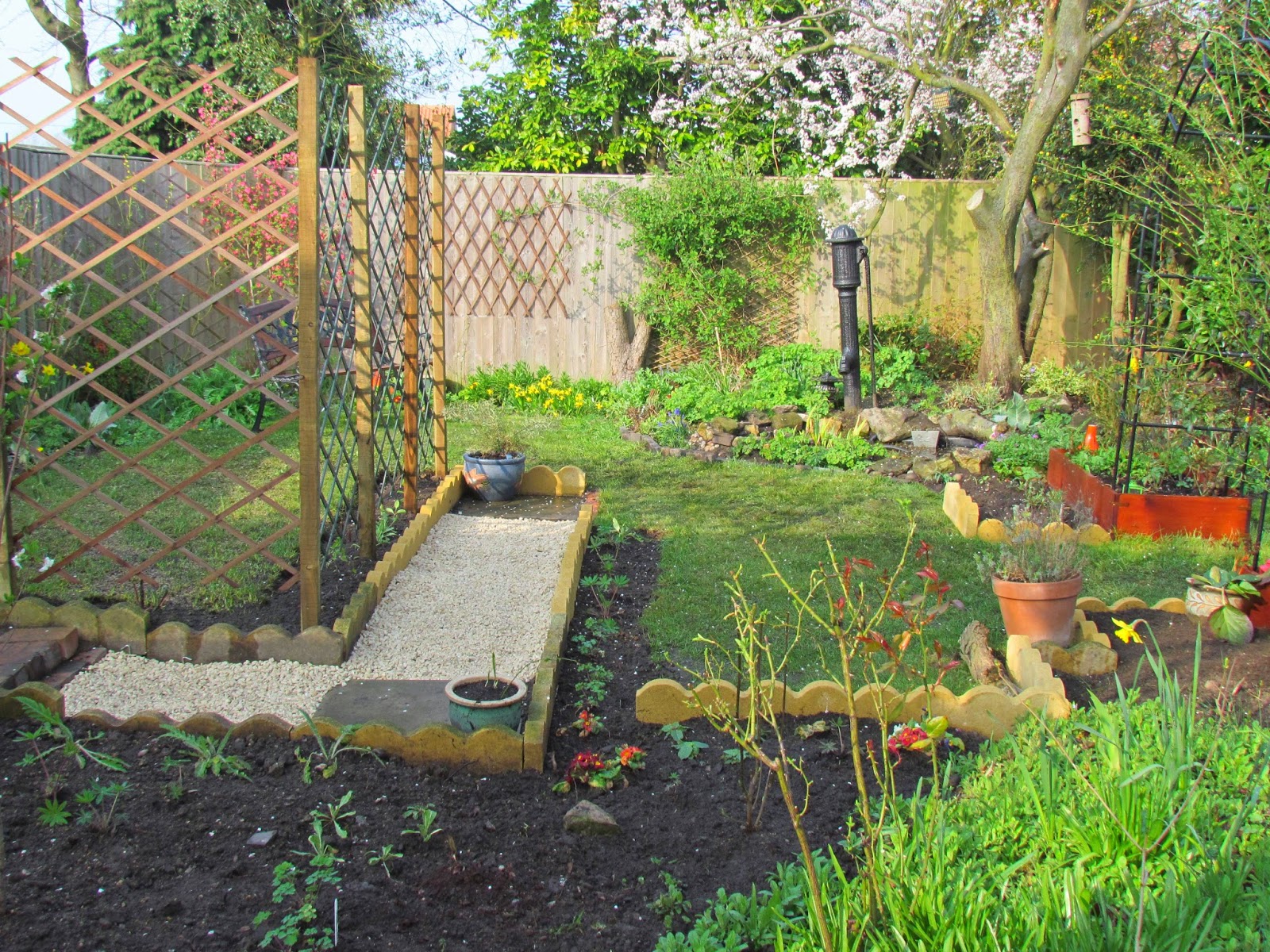
All the best garden design books (and my loving husband!) say you should plan your design on paper before you begin to dig up the lawn. Did I do that? Well, I sort of did because I wandered round and pictured what I wanted in my head ... I just didn't do the measuring and drawing thing! Anyway, when I changed the back of the garden two years ago I was very happy with it.
BEFORE
AFTER
Living with it for 24 months though has highlighted the short-comings so changes had to be made.
I have been busy over the last couple of weeks ... can you spot the differences?
NOW
1. I have removed the middle trellis. It looked lovely with sweetpeas growing all over it last summer but it was annoying having to walk all the way round to get into the back of it. Extending the path through the trellis makes life easier.
2. I have widened the borders and edged them with curved stones so there's more planting space. I have put roses in there and in the square border front right in the photo. This border is covered in Forget-me-nots and orange poppies: should look good in a couple of weeks.
3. The path to the right of the trellis has gone. We never used it. If I had used paper to design it I would have taken note of where we actually walk when we cross the garden and realised the path didn't belong where I put it! Anyway, it has gone so I have yet more border to fill! Good job I got that greenhouse!
4. The old bricks at the back gate were replaced some time ago by the fossil slab.
BEFORE
NOW
I must say it looked very neat and tidy two years ago but it has more of a lived in feel to it now ... and the paths make more sense!
I now have ideas for the front garden ..... where did I put that drawing pad?


How lovely! A lovely garden indeed!
ReplyDeleteOur garden evolves rather than being planned on paper. In this month's GW magazine Alan Titchmarsh says, "I have great sympathy with anyone who has no truck with planning a garden on graph paper".
ReplyDeleteVery nice changes. As you say it looks "lived in". I think if a garden looks "natural" then it looks and feels good like yours.
ReplyDelete